SOURCE PR – REBRAND & WEBSITE
Brief
We were asked by Source to look at helping them rebrand and carry that branding through to a website redesign.
Although their most recent website was fairly new, the company was undergoing some restructuring and they wanted to use the opportunity as a fresh start.
The Look & Feel
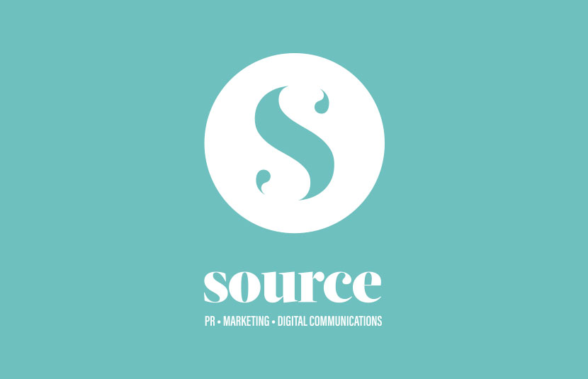
The client wanted a clean, minimal and modern feel to their logo, and were keen to incorporate a jade green colour. They were keen to move away from the square that they previously used.
The Solution
The client decided to strip back their name just to Source, so as well as investigating different shapes we looked a typographic solution.
When creating our initial sketches, we noticed that the serifs of the letter S could be transformed into inverted commas, which represent part of what Source do – creating written content. This both represented the business and felt aesthetically right, creating more of a curve and implied lines through those curves. This sat well within a number shapes, including a hexagon and a circle, the latter being what the client chose.
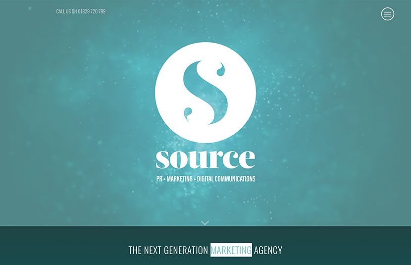
When carrying this through the website, we wanted the logo to appear transparent, so we incorporated some textural video behind the logo and in other sections of the website.
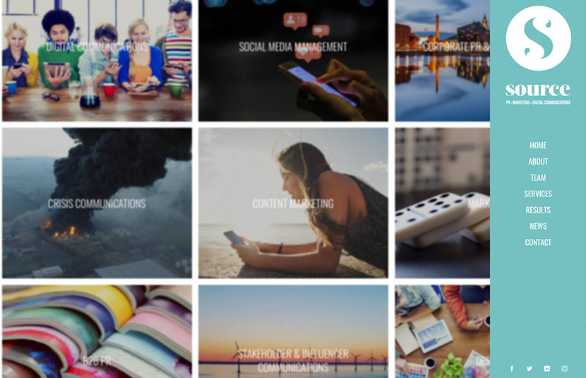
Shades and tones of the jade green were used throughout the website to give a harmonious feel.
The Client
Click here to view Source PR
