New Packaging Design for Mrs Darlington’s
Red Fred Creative has been working with Darlington & Daughters since 2007 and are one of our favourite clients to work with. (Not just because we get to sample the delicious Jams, Chutneys and Preserves!).
We are always proud to see our work donning the shelves of farm shops, delicatessens and cafés up and down the country and also in sunnier climes!
When we first started working together the objective of the client was to unify the design of their labels, whilst retaining a ‘home made’ feel, to help export the product overseas. The export initiative has been a great success and Red Fred have worked on versions of the labels for three different continents.
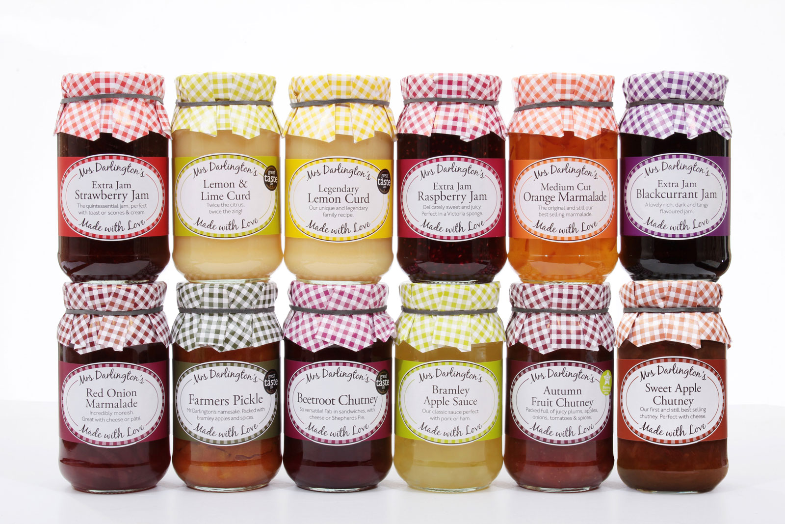
Almost 12 months ago we were tasked with the objective of moving the labels forward another step, to look more “polished, but still down to earth”. Fast forward to 2015 and the new design labels are starting to hit the shelves.
The design process started with extensive research including considering the competition, font selection, colour choices, sizing and trading standards compliance. The result is a range of over seventy labels that we are very proud of. The new packaging design has great shelf presence and distinction. We’ve even redeveloped the trademark gingham ‘mop cap’ to add more refinement and created space on the front of the jar to allow for a small description and serving suggestion. The packaging design also accommodates nutritional information, in-line with new trading standards regulations.
The identity was applied to large catering tubs, multiple language versions and eventually a brochure, which we’ll blog about in the coming weeks as it rolls of the presses.


