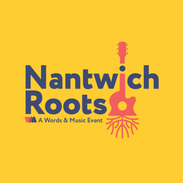
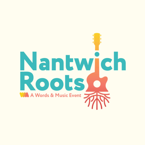
Nantwich Roots Festival Logo
We’ve been working with the Words and Music Festival for around five years. Being a team of music fans, it’s a sector we enjoy working in, and we were excited to be asked to create the logo for the resurrected “Folk and Roots Festival” which used to be held annually in Nantwich.
The festival organiser expressed an interest in incorporating a guitar in the logo somewhere, so out came the sketchbooks and the work began. We looked a various ways of incorporating a guitar into the logo, which was challenging because of it’s unwieldy shape. Our solutions were diverse and included a guitar shaped tree, a wooden infinity symbol forming the body of the guitar and an acoustic guitar with the bottom half made up of roots.
The roots could be represented in many ways, originally they were very natural but this design looked too chaotic and required a little finessing. We looked to Art Nouveau for inspiration, the often symmetrical natural shapes helped complete the logo into what you see here.
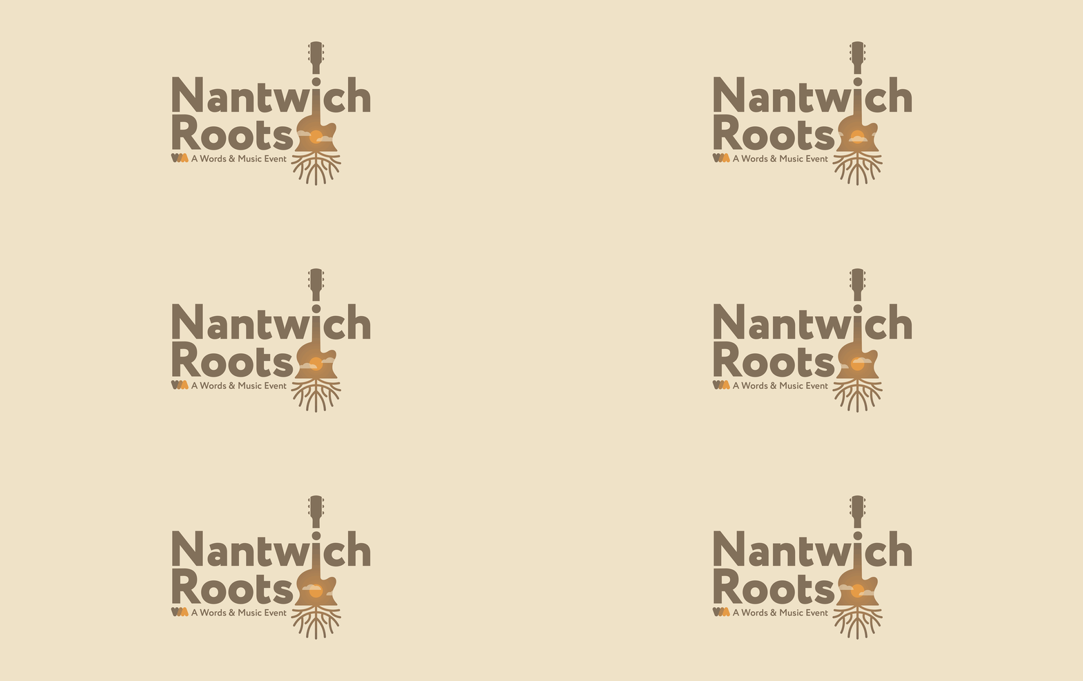
We then moved to selecting colours, where we researched well known album covers which could be placed into the “Roots” category. Neil Young’s Harvest Moon was one of the colour choices, and inspired a variant logo which used the hole in the body of the guitar as sun, inferred by using clouds. This was taken a step further for online use, where we animated the clouds drifting over the sun.
At the time of writing the line up is yet to be revealed, but here’s a look at a few of the colour variants which were selected by our client.
