MRS DARLINGTON’S – PACKAGING DESIGN
Brief
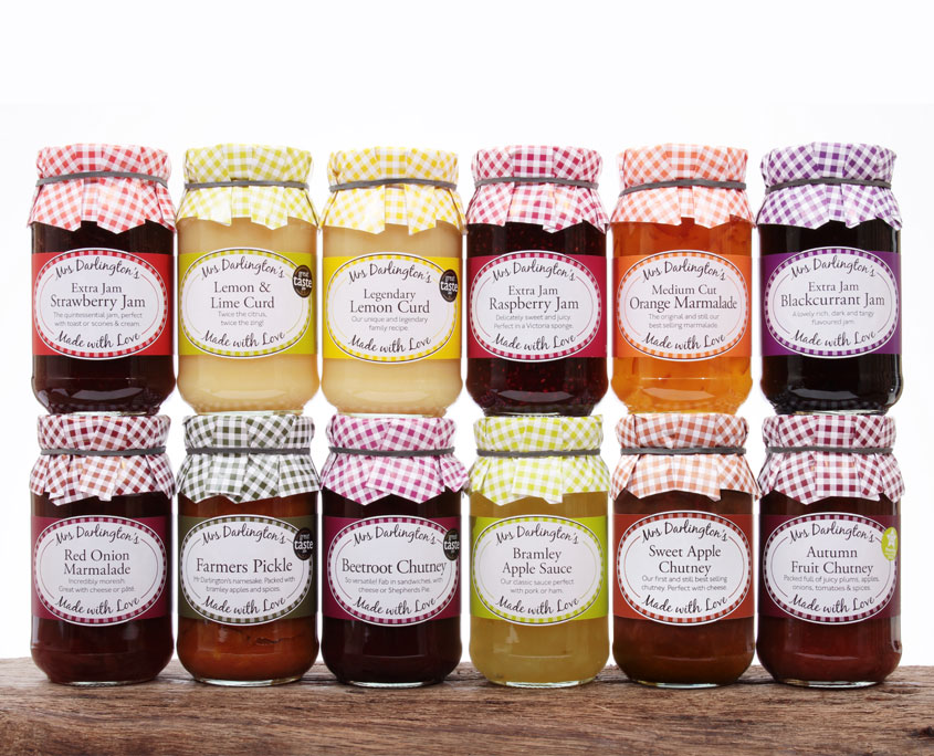
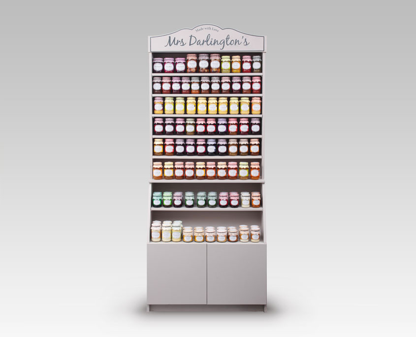
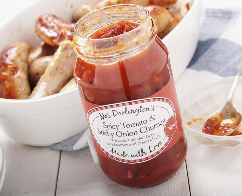
Redesigning the packaging for a product line of over 90 products isn’t an easy job, but RedFred were more than up for the challenge. The brief was a simple one, retain a one piece label, must have the characteristic gingham, to be printed in two colours and make each label distinctive. We first redesigned the Mrs Darlington’s packaging back in 2008, but the client had moved on quite a lot since then; exporting to four different continents, a constantly evolving product range and a growing, loyal customer base.
The Look & Feel
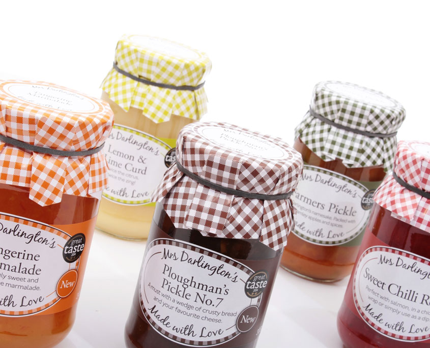
Bright, easy to read with the feel of quality. Two colour print, with a single piece label and mop cap.
The Solution
Red Fred set out and researched the competition, on the high street and in the farm shop. We identified several elements that we wanted to keep, but update. It was important to the client that the existing customer base didn’t feel alienated by a revolutionary redesign.
After several months development we settled on a few key changes; a redesigned gingham check, additional nutritional information, new typefaces and special print finishes.
The evolution has gone down well with the aforementioned loyal customer base, with the product range continuing to grow and recently being voted the best independent preserves brand in the UK by a Guild of Fine Food survey. The future’s looking bright for Mrs Darlington’s.

