CHSA Brand Development
Brief
CHSA selected Red Fred Creative as a consultant for their brand development project. This was partly due to our specific approach that includes our ‘Big Idea’ development workshop. The Cleaning and Hygiene Suppliers Association represent the manufacturers and distributors that supply cleaning and hygiene products in the UK.
CHSA members include multinational and national brands such as Bunzl, PHS, Kimberly-Clark & Berry Bpi. It aims to support and represent their members to ensure they prosper and advance. This is primarily achieved through the maintenance and enhancement of standards within quality ethics and sustainability.
The key to the success of the brand development is to present the CHSA as a standard bearer for the industry. An organisation that is committed to upholding strict codes of practice. The branding must convince the prospective member or patron that CHSA is a dynamic and responsible organisation. An institution with values that they can identify with and whose membership will enhance their business.
The Look & Feel
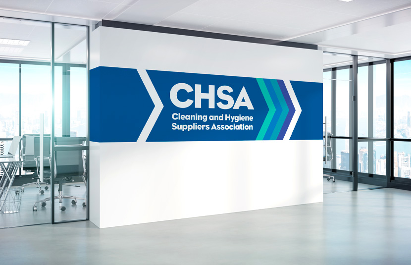
The outgoing identity had some legacy value and a blue colour was retained but augmented with new complimentary shades. The organisation has many facets and wishes to present a committed, responsible identity that can be trusted to uphold industry standards. The treatment of the typography within the arrowhead device shows the constant drive to attain and stretch these goals.
The Solution
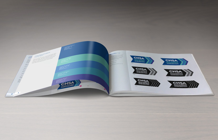
The outcome of the brand development project was a monolithic brand architecture. A strong master brand that leverages this strength when applied to the certification and accreditation marques. We recommended a close synergy between the main logo and the accreditation and certification logos.
The brand guidelines feature examples of how to use the new logo in primary and secondary colour-ways. It also included designs for business stationery and information on how to lay out corporate brochures, documents and accreditations.
Additional items were also included such as a press adverts, banner stands, certificates and digital marketing banners.
The Result
The brand development project has been very well received by the management team and members alike. The identity is carried across the accreditation schemes and the CHSA brand has become synonymous with reliability and quality. The new logo and brand guidelines have taken this to a new level with membership and industry awareness growing as a result. Since the brand development project was completed RED FRED CREATIVE have also been retained to produce additional work including on the development of the CHSA website.


