Words & Music Festival Design
For the third year running, Red Fred Creative have been asked for our support in the Words & Music Festival Design and Marketing. We’re all huge fans of music here, so we were happy to be involved.
When designing for the previous years, we’ve always gone for a hook with the festival’s number. Ten was X, so we came up with The Crossroads – linking in with the legendary blues song. Last year was eleven, and we instantly thought of “This is Spinal Tap”, and turning the volume up to eleven.
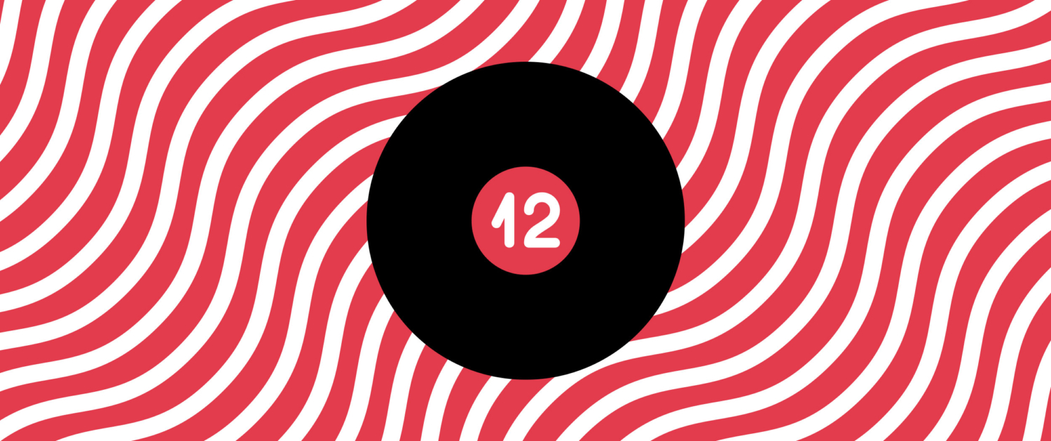
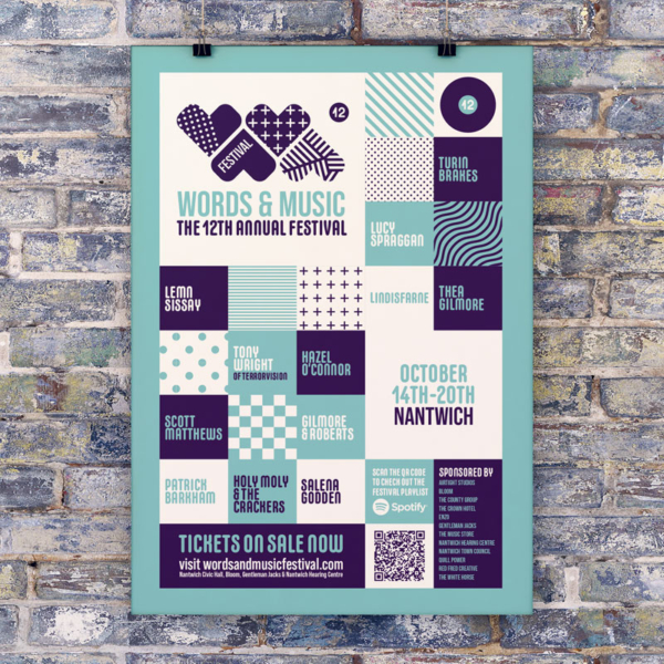
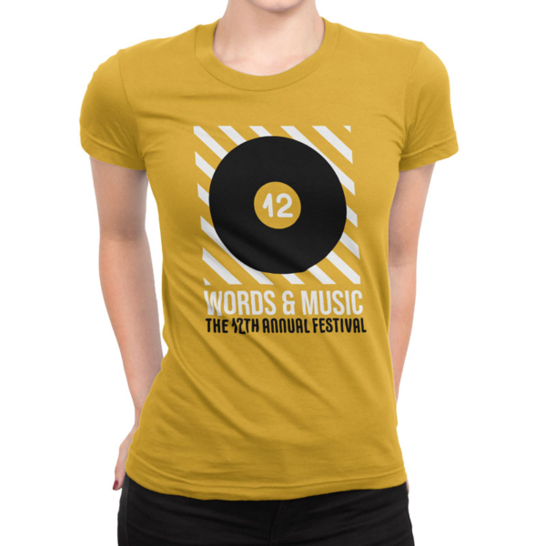
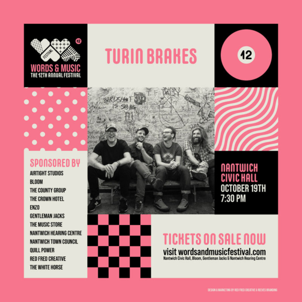
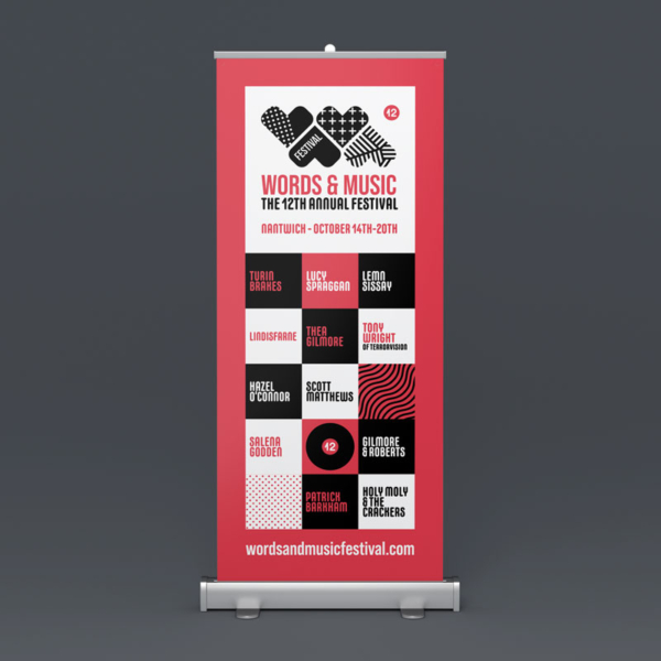
Twelve was no different, and we eventually settled on the concept of vinyl records. The 12 logo is a minimalist graphic of a record, and the grid we used was based on the idea of album covers – which are approximately square.
The look we went for was inspired by old gig flyers, when punk bands would print and photocopy flyers onto coloured paper to hand outon the streets and stick them up on walls and in phone boxes.
Introducing colour was something we wanted to do, to set the marketing apart from things we’d done in previous years. We chose a scheme of 6 different colour palettes, and took them through to everything we’ve done so far, even choosing to give each page a different scheme on the Words and Music Festival Website Design.
To the right is a small sample of the work we’ve done for print, web and social media. We’re all very much looking forward to the festival this October, tickets are on sale here.
